
(Created target blank page For Version: PSAAS:Public) |
(Update with the copy of version: 8.5.0) |
||
| Line 1: | Line 1: | ||
| − | < | + | = Styling the widgets= |
| + | __NOTOC__ | ||
| + | ==Themes== | ||
| + | |||
| + | You can change the appearance of Genesys Widgets using ''themes''. Themes allow you to change colors and fonts for all widgets. | ||
| + | |||
| + | Genesys Widgets includes two built-in themes, "dark" and "light". The "dark" theme is active by default. | ||
| + | |||
| + | '''Dark Theme''' | ||
| + | |||
| + | [[File:widgets-theme-dark.png|widgets-theme-dark.png]] | ||
| + | |||
| + | '''Light Theme''' | ||
| + | |||
| + | [[File:widgets-theme-light.png|widgets-theme-light.png]] | ||
| + | |||
| + | ==How do I set the active theme?== | ||
| + | |||
| + | There are two methods for setting the active theme: | ||
| + | |||
| + | '''Configuration''' | ||
| + | |||
| + | <source lang="javascript"> | ||
| + | window._genesys.widgets.main.theme = "light"; // or "dark" | ||
| + | </source> | ||
| + | |||
| + | '''Widget Bus Command''' | ||
| + | |||
| + | <source lang="javascript"> | ||
| + | window._genesys.widgets.bus.command("App.setTheme", {theme: "light"}); // or "dark" | ||
| + | </source> | ||
| + | |||
| + | ==How do I create my own themes?== | ||
| + | |||
| + | Themes are simple CSS class definitions that you specify and register with Genesys Widgets. | ||
| + | |||
| + | When creating your own themes, they are restricted to the following CSS properties: | ||
| + | |||
| + | *color | ||
| + | *background | ||
| + | *font-family | ||
| + | *font-style | ||
| + | *border-color | ||
| + | *border-style | ||
| + | * and other non-structural properties | ||
| + | |||
| + | '''Sample Theme''' | ||
| + | |||
| + | <source lang="css"> | ||
| + | .cx-widget.cx-theme-blue{ | ||
| + | |||
| + | color: #FDFDFD; | ||
| + | background: #1e5799; | ||
| + | } | ||
| + | |||
| + | .cx-widget.cx-theme-blue *{ | ||
| + | |||
| + | border-color: #7DB9E8; | ||
| + | } | ||
| + | </source> | ||
| + | |||
| + | '''End Result'''<br/> | ||
| + | [[File:WebChat-Screenshot-Form-Desktop-Blue.png|link=]] | ||
| + | |||
| + | {{NoteFormat|Exercise caution when you make changes to the CSS to make sure structure and functionality are retained.|3}} | ||
| + | {{NoteFormat|Avoid setting CSS properties that change height, width, thickness, size, visibility, or other properties that change the structure of widgets. These properties are not supported and changing them could break widget stability and usability.|3}} | ||
| + | {{NoteFormat|By default, the Widgets CSS refers to the Roboto font, available at https://fonts.google.com/}} | ||
| + | |||
| + | ==How do I register my themes with Genesys Widgets?== | ||
| + | |||
| + | You can register themes in the Genesys Widgets configuration. | ||
| + | |||
| + | <source lang="javascript"> | ||
| + | window._genesys.widgets.main.themes = { | ||
| + | |||
| + | "blue": "cx-theme-blue" | ||
| + | }; | ||
| + | </source> | ||
| + | |||
| + | The name:value pair used here consists of a key ("blue") and the theme's CSS classname ("cx-theme-blue"). | ||
| + | |||
| + | You can add as many themes to this list as you need and select the active theme using one of the key values. | ||
| + | |||
| + | <source lang="javascript"> | ||
| + | window._genesys.widgets.main.theme = "blue"; | ||
| + | |||
| + | // OR | ||
| + | |||
| + | window._genesys.widgets.bus.command("App.setTheme", {theme: "blue"}); | ||
| + | </source> | ||
| + | |||
| + | ==How do I change styles for a specific widget?== | ||
| + | |||
| + | It is possible to specify specific widgets and even specific elements within a widget by appending the widget's CSS classname to the theme classname. | ||
| + | |||
| + | In the following example, we extend the "cx-theme-blue" class with a widget-specific entry that makes the WebChat widget's background color a darker shade. | ||
| + | |||
| + | <source lang="css"> | ||
| + | .cx-widget.cx-theme-blue{ | ||
| + | |||
| + | color: #FDFDFD; | ||
| + | background: #1e5799; | ||
| + | } | ||
| + | |||
| + | .cx-widget.cx-theme-blue *{ | ||
| + | |||
| + | border-color: #7DB9E8; | ||
| + | } | ||
| + | |||
| + | .cx-widget.cx-theme-blue.cx-webchat, .cx-widget.cx-theme-blue .cx-webchat{ | ||
| + | |||
| + | background: #225897; | ||
| + | } | ||
| + | </source> | ||
| + | |||
| + | [[File:widget-specific-theme-001.png|link=]] | ||
| + | |||
| + | {{NoteFormat|Notice the dual CSS selector used when specifying a widget. This is required to make sure your styles always apply properly.}} | ||
| + | |||
| + | '''Widget-Specific and Element-Specific''' | ||
| + | |||
| + | In the next example, we further extend the "cx-theme-blue" class with a widget and element-specific entry that changes the background color of the input fields within the WebChat widget to a light shade of blue. | ||
| + | |||
| + | <source lang="css"> | ||
| + | .cx-widget.cx-theme-blue{ | ||
| + | |||
| + | color: #FDFDFD; | ||
| + | background: #1e5799; | ||
| + | } | ||
| + | |||
| + | .cx-widget.cx-theme-blue *{ | ||
| + | |||
| + | border-color: #7DB9E8; | ||
| + | } | ||
| + | |||
| + | .cx-widget.cx-theme-blue.cx-webchat, .cx-widget.cx-theme-blue .cx-webchat{ | ||
| + | |||
| + | background: #225897; // Darker Shade | ||
| + | } | ||
| + | |||
| + | .cx-widget.cx-theme-blue.cx-webchat .form input, .cx-widget.cx-theme-blue .cx-webchat .form input{ | ||
| + | |||
| + | background: #DCF5FF; // Lighter Shade | ||
| + | } | ||
| + | |||
| + | </source> | ||
| + | |||
| + | [[File:widget-specific-theme-002.png|link=]] | ||
| + | |||
| + | ==How do I change the layout and structure of widgets?== | ||
| + | |||
| + | Genesys Widgets only support customizing a limited set of styles through themes. If you wish to use an alternate layout of your own design, you can disable the widget you want to replace and utilize the provided service plugins to build your own. | ||
| + | |||
| + | '''Choosing Which Plugins to Load''' | ||
| + | |||
| + | Refer to the 'plugins' configuration option here: [[Documentation:PSAAS:Administrator:AppConfiguration|App Configuration]] | ||
| + | |||
| + | '''Service Plugins''' | ||
| + | |||
| + | Service plugins provide a high-level API for quickly integrating a UI with back-end services. | ||
| + | Each widget is matched with a corresponding service plugin. This separation allows for advanced integrations. | ||
| + | |||
| + | *[[Documentation:PSAAS:Administrator:WebChatService|WebChatService]] | ||
| + | *[[Documentation:PSAAS:Administrator:SendMessageService|SendMessageService]] | ||
| + | |||
| + | {{NoteFormat|Changing the layout of official Genesys Widgets is not supported. We cannot guarantee that your changes will remain when upgrading to a newer version of Genesys Widgets.|3}} | ||
| + | |||
| + | [[Category:V:PSAAS:Public]] | ||
Revision as of 13:39, August 10, 2017
Styling the widgets
Themes
You can change the appearance of Genesys Widgets using themes. Themes allow you to change colors and fonts for all widgets.
Genesys Widgets includes two built-in themes, "dark" and "light". The "dark" theme is active by default.
Dark Theme
Light Theme
How do I set the active theme?
There are two methods for setting the active theme:
Configuration
window._genesys.widgets.main.theme = "light"; // or "dark"Widget Bus Command
window._genesys.widgets.bus.command("App.setTheme", {theme: "light"}); // or "dark"How do I create my own themes?
Themes are simple CSS class definitions that you specify and register with Genesys Widgets.
When creating your own themes, they are restricted to the following CSS properties:
- color
- background
- font-family
- font-style
- border-color
- border-style
- and other non-structural properties
Sample Theme
.cx-widget.cx-theme-blue{

    color: #FDFDFD;
    background: #1e5799;
}

.cx-widget.cx-theme-blue *{

    border-color: #7DB9E8;
}
End Result
File:WebChat-Screenshot-Form-Desktop-Blue.png
How do I register my themes with Genesys Widgets?
You can register themes in the Genesys Widgets configuration.
window._genesys.widgets.main.themes = {

    "blue": "cx-theme-blue"
};
The name:value pair used here consists of a key ("blue") and the theme's CSS classname ("cx-theme-blue").
You can add as many themes to this list as you need and select the active theme using one of the key values.
window._genesys.widgets.main.theme = "blue";

// OR

window._genesys.widgets.bus.command("App.setTheme", {theme: "blue"});
How do I change styles for a specific widget?
It is possible to specify specific widgets and even specific elements within a widget by appending the widget's CSS classname to the theme classname.
In the following example, we extend the "cx-theme-blue" class with a widget-specific entry that makes the WebChat widget's background color a darker shade.
.cx-widget.cx-theme-blue{

    color: #FDFDFD;
    background: #1e5799;
}

.cx-widget.cx-theme-blue *{

    border-color: #7DB9E8;
}

.cx-widget.cx-theme-blue.cx-webchat, .cx-widget.cx-theme-blue .cx-webchat{

    background: #225897;
}
File:Widget-specific-theme-001.png
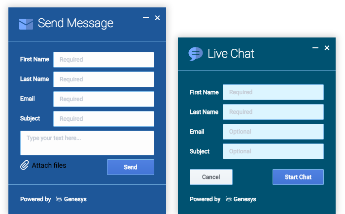
Widget-Specific and Element-Specific
In the next example, we further extend the "cx-theme-blue" class with a widget and element-specific entry that changes the background color of the input fields within the WebChat widget to a light shade of blue.
.cx-widget.cx-theme-blue{

    color: #FDFDFD;
    background: #1e5799;
}

.cx-widget.cx-theme-blue *{

    border-color: #7DB9E8;
}

.cx-widget.cx-theme-blue.cx-webchat, .cx-widget.cx-theme-blue .cx-webchat{

    background: #225897; // Darker Shade
}

.cx-widget.cx-theme-blue.cx-webchat .form input, .cx-widget.cx-theme-blue .cx-webchat .form input{

    background: #DCF5FF; // Lighter Shade
}
How do I change the layout and structure of widgets?
Genesys Widgets only support customizing a limited set of styles through themes. If you wish to use an alternate layout of your own design, you can disable the widget you want to replace and utilize the provided service plugins to build your own.
Choosing Which Plugins to Load
Refer to the 'plugins' configuration option here: App Configuration
Service Plugins
Service plugins provide a high-level API for quickly integrating a UI with back-end services. Each widget is matched with a corresponding service plugin. This separation allows for advanced integrations.