(Modified comment string __NOINDEX__ Category:V:PSAAS:Public with Category:V:PSAAS:Public) |
(Modified comment string {{Template:PEC_Migrated}} with __NOINDEX__ {{Template:PEC_Migrated}}) |
||
| Line 1: | Line 1: | ||
= User Interface= | = User Interface= | ||
| + | __NOINDEX__ | ||
{{Template:PEC_Migrated}} | {{Template:PEC_Migrated}} | ||
Latest revision as of 12:32, October 2, 2020
Contents
User Interface
Supported browsers
Designer supports the latest versions of the following web browsers:
- Mozilla Firefox
- Google Chrome
- Microsoft Edge
- Apple Safari
The minimum display resolution supported by Designer is 1920 x 1080.
User interface overview
Watch this video to see an overview of the Designer user interface:
The various elements within the interface are described below.
Provides one-click access to Applications, Shared Modules, Media Resources, Digital Resources, Speech Grammars, and Business Controls objects.
Workspace toolbar
Provides buttons for common actions. Click your user name to log off. Click the settings icon to view or modify the global Caching settings for certain resources and to toggle certain Features. Click the Help icon to access the Designer Help.
Application toolbar
Provides buttons for common actions. Click Settings to set global settings for your application. Click Save Flow to save and validate your application, or click Publish to save and validate your application and prepare it for use by routing engines. Click Build to create and manage the builds associated with the application.
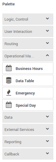
Palette
Provides all available blocks that you can use in your application, sorted by functional grouping:
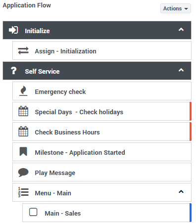
Application flow
Provides the main area to build your application by adding blocks vertically. (See Build Logic for more information.)
Help pane
Displays help information for the selected block:
Block properties
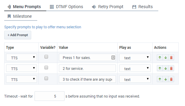
Displays all properties exposed by a block and provides assistance to set them:
Search bar
Most Designer pages have a search bar located near the top-right corner:
You can use this search bar to find items on that particular page. As you start typing, the items on the page are filtered to only show those items that match the terms you've entered.
There are additional levels of search available when you are working directly within an application flow. See Searching the application flow.
Actions toolbar
Many of the resource pages in Designer have an Actions toolbar:
The action items on the toolbar will vary based on the resource page you are viewing. Depending on the functions available for that particular resource, you can use this toolbar to do the following:
View History
Use the View History button (![]() ) to open the history view (or audit log) for a resource.
) to open the history view (or audit log) for a resource.
The history view shows you a list of each time the resource was viewed, edited, or published, the user who made the change, and the new and previous value of any properties that were changed.
You can use the buttons on the page to view the results for a specific time period (for example, last 1W to see the results for previous week), or use the date fields to specify a custom date range. Results can be sorted or searched and you can use the Export button to export the results as a CSV file.
You can drill-down further into each results item by double-clicking it. This opens an audit window opens that displays additional details for that particular event.
List Media/Message Collection Consumers
Use the List Media/Message Collection Consumers button (![]() ) to see information about which applications and modules are using that particular media or message collection.
) to see information about which applications and modules are using that particular media or message collection.
Clone
Use the Clone button (![]() ) to clone the resource. You'll have to give the cloned resource a unique name.
) to clone the resource. You'll have to give the cloned resource a unique name.
List Module Versions
Use the List Module Version button (![]() ) to view the version history for a shared module. You can then choose to make a version public, or view a version (in read-only mode) as it appeared at a particular time.
) to view the version history for a shared module. You can then choose to make a version public, or view a version (in read-only mode) as it appeared at a particular time.
Export
Use the Export button (![]() ) to export a resource. This exports the selected resource for use in another Designer workspace. When you export a resource, all versions of that resource are exported, including the unpublished version.
) to export a resource. This exports the selected resource for use in another Designer workspace. When you export a resource, all versions of that resource are exported, including the unpublished version.
Import
This Actions item is only available on the Data Tables page. Use the Import button (![]() ) to import the contents of a CSV file into the selected data table.
) to import the contents of a CSV file into the selected data table.
Delete
Click Delete (![]() ) to delete all versions of the resource. However, published applications that were using the resource (in other words, applications that had previously generated their code) are not affected.
) to delete all versions of the resource. However, published applications that were using the resource (in other words, applications that had previously generated their code) are not affected.
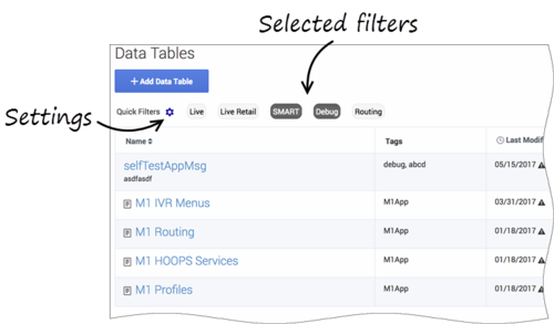
Quick filters
This toolbar enables you to filter a list of resource items by selecting one or more filters that are associated with tags. The list then refreshes to show only those items that match the selected filters.
In this example, the SMART and Debug filters are selected so that only data tables with those tags are shown:
Note that the filters will display any item in the list that has the associated tag, even if there are other tags associated with that item. If you navigate to a new resource page (such as going from Data Tables to Business Hours), any selected filters are automatically applied to the new page.
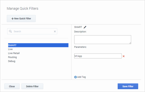
To add, modify, or delete quick filters, click the Settings icon to open the Manage Quick Filters window. To associate a filter with a specific tag, select it, and add the tag(s) under the Parameters section.
In the above example, the SMART filter was associated with the "M1App" tag, as follows:
The Quick Filters toolbar appears on the following resource pages: Special Days, Business Hours, Data Tables, Applications, Shared Modules, Emergency Flags, Media Resources, and Digital Resources. The same filters appear on each page, and any filters that you create are visible to other Designer users.

