Viewing Your Reports
While you are working in the GPlus Adapter for Salesforce, you can view reports and statistics at any time. This information is important for you to see so that you can gauge the call wait times and monitor your Key Performance Indicators (KPIs).
Reports and statistics are available to you through the main menu. Click the tabs below to view information about each of the report types:
Reports
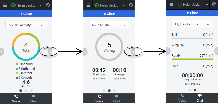
The Reports view for voice interactions displays two pages: My Call Activity and My Handle Time. To navigate between the pages, use the arrows on the left and right side of the adapter.
- On the My Call Activity page, you can view a diagram that represents the averages of calls per hour and call time. Call Activity metrics include Total calls, Inbound calls, Outbound calls, Internal calls, and Consult calls.
- On the My Handle Time page, you see metrics in minutes) for Total time, Talk time, Wrap Up time, Ready time, and Hold time.
My Statistics
The My Statistics tab of the Main View displays the list of your Key Performance Indicators (KPIs).
The KPIs displayed are configured by your system administrator. The statistics defined as KPIs could also be evaluated for the agent groups of which you are a member.
Click column heads to change the sort order of the KPIs.
The My Statistics tab displays your current KPIs and a summary of the KPIs of your work group(s). The My Statistics tab enables you to compare your performance with the overall performance of the group(s) to which you belong.
A warning icon might be displayed in the left-most column of the row. The warning icon is displayed if the evaluation of your performance for the KPI goes beyond the expected warning level for the KPI (![]() ).
).
An error icon might be displayed next to a KPI if the evaluation of the performance is below the expected error level for the KPI (![]() ).
).
A worst icon might be displayed next to a KPI if the evaluation of the performance is below the expected error level for the KPI (![]() ).
).
If a statistic has been configured incorrectly, the background of the statistic becomes red and the error icon is displayed. You should report errors immediately. The reason for the problem is displayed in a tooltip if you place your mouse pointer over the problematic statistic row.
Contact Center Statistics
The Contact Center view for voice interactions displays a summary of your Routing Point metrics, including Current Max Wait Time, and Average Wait Time.
Tracking of Answered calls and Abandoned calls is charted at the bottom of the dashboard and is divided into two tabs: Past 60 Minutes, and Past 24 Hours.
You can switch between configured Routing Point dashboards by selecting the desired dashboard from the dropdown in the upper-right corner or by selecting the pop-up arrows on either side of the dashboard.

