Contents
Heatmap
The Heatmap dashboard uses colors to show a graphical representation of individual values. The graph changes colors when certain counts (or thresholds) for the selected field are reached.
Reports on this dashboard
Count Over Time
(See Count Over Time.)
Filter
(See Filter.)
Heatmap
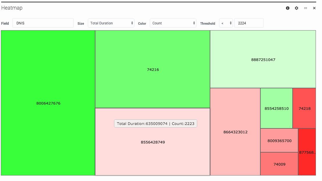
Basically, the heatmap is a collection of colored rectangles that represent the session counts for a particular field.
If you look at the example above, the Heatmap panel shows the session counts for the DNIS field, with the size and colors of the rectangles changing as the Total Durations values increase or decrease. The longer the Total Durations, the larger the rectangle, and the color progression goes from green to red based on the Count, with the color intensity set by the Threshold.
So, in this example, the largest rectangle (DNIS=8006427676) had the longest Total Duration, while the smallest (DNIS=87568) had the shortest. As the Threshold is set to < 2224, rectangles where the count is less than that are in red. The deeper the red, the further away the count is from the set threshold.

